Dauphine's Dandies UX Design

The Product: Dauphine’s Dandies are one of the premiere jazz bands in New Orleans. They travel the country playing shows and performing for private bookings year round. Dauphine’s Dandies are looking to target music lovers from all backgrounds who have an appreciation for live music, in particular jazz.
The Challenge: Music lovers and managers of entertainment venues need a one stop shop for music samples, information about the band, and contact information for bookings without having to search multiple sites.
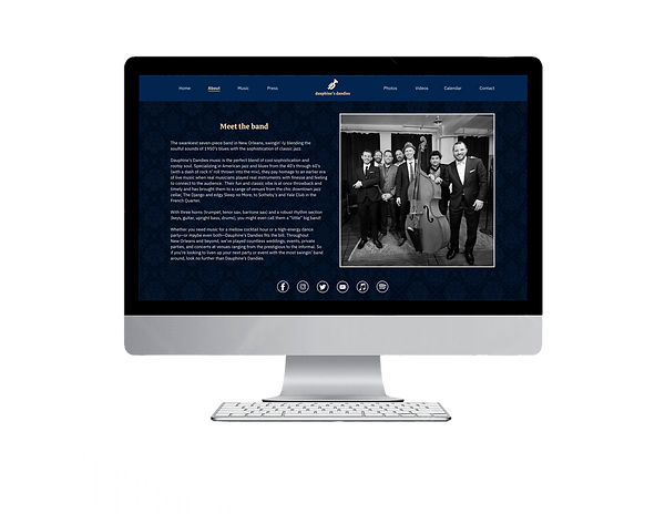
The Goal: Design a website with all the essential information pertaining to Dauphine’s Dandies, complete with a music sampler, links to purchase albums, up-to-date calendar of shows, and contact information for bookings.
Project duration: May 2023
My role: UX Designer creating the website design for Dauphine’s Dandies in both desktop and mobile format from conception to delivery.
Responsibilities:
User research, paper and digital wireframing, low and high-fidelity prototypes, conducting usability studies, accounting for accessibility, and iterating on designs.
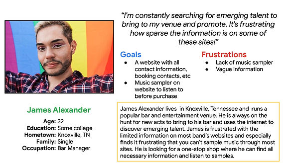
Research: I conducted interviews and created empathy maps for the users I would be designing for to find their specific needs and wants. A primary user group that was identified through my research was busy entertainment venue managers seeking all the necessary information for booking a jazz band in one convenient location.
The research confirmed initial assumptions about Dauphine’s Dandies’ target demographic but also illuminated other wants and needs. Other problems the users identified were the need for a music sampler, an up-to-date calendar of shows with a link to tickets, and a way to purchase albums.

Personas:

Key Insights:
Through my research I discovered some definitive user needs.


Time
Users don’t have time to spend hours searching for new music and relevant information regarding the musicians, including contact information
Accessibility
Music websites are not equipped with assistive technology
Sample Before Purchase
Users want to ensure they enjoy the music before they purchase an album
Ideation: Based off of the user interviews and information gathered through competitive audits of other jazz bands’ websites, I came up with a sitemap that addressed the majority of the areas for improvement. I then sketched wireframes for both the desktop and mobile versions of the website.

Sitemap for the Dauphine's Dandies Jazz Band website

Paper wireframe of the homepage design for the desktop version of the Dauphine's Dandies website

Paper wireframe of the homepage design for the mobile version of the Dauphine's Dandies website
Process: I discovered that clear navigation, delineated sections, and a music sampler were key user needs during the user interviews. I created digital wireframes and low-fidelity prototype for the desktop and mobile versions of the website in order to move on to testing through usability studies.
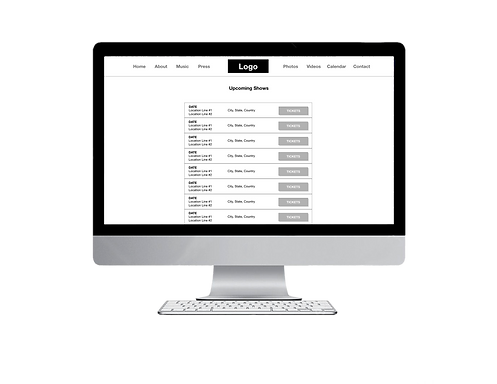


The low-fidelity prototype showed the anticipated user flow for navigating the website and exploring the various features. This enabled me to conduct usability studies and test out the
initial design.
The low-fidelity prototype can be
viewed here.
Usability Study Findings: I conducted two rounds of usability studies, using the findings from the first round to iterate the mockups that would be used for the second round of studies. The second study involved providing users with a high-fidelity prototype to determine what aspects of the mockups needed refining for the final product.

Solution:


The initial usability study revealed that users needed additional emphasis on the navigation. I added a color change for the active page that the user was navigating to as well as an underline to the title of the page the user is on in order to help emphasize the navigation of the site.
It was very clear from the usability study that users considered a music player a must. I created a full track sampler for each of the band’s albums so the user can sample the full album prior to making a purchase. I wanted to create a full track sampler so the user doesn’t feel cheated or swindled into making an unwanted purchase.


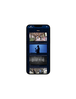
It was brought to my attention that the mobile iteration of the site needed refining because it was difficult to use for most users. I re-designed the layout and made adjustments in order to increase button sizes as well as font, making the app more accessible and easier for users to navigate.


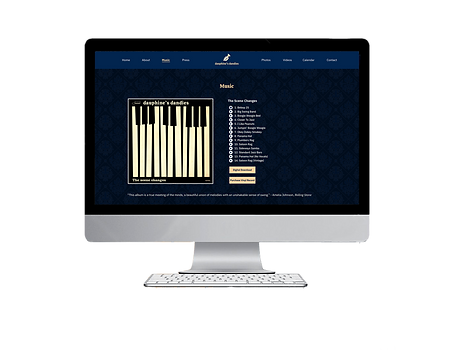

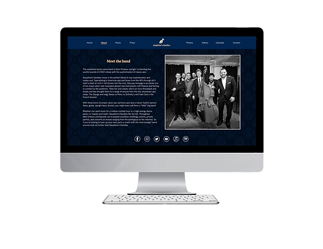

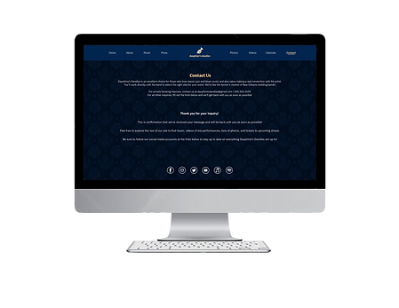
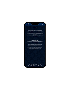

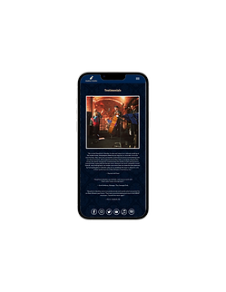


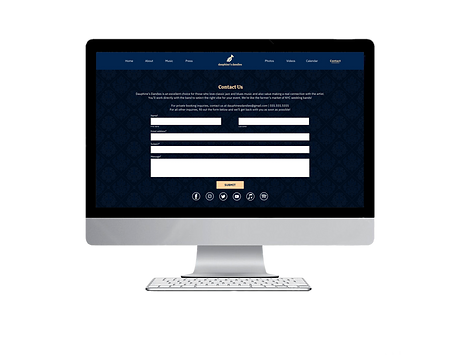


The final high-fidelity prototype presented shows cleaner user flows with enhanced visual cues to aid with navigation. It also features an enhanced music player with more prominent buttons, a more streamlined mobile layout, and was designed with accessibility standards in mind for all users. The high-fidelity prototype can be viewed here.
Conclusion: The Dauphine’s Dandies website design makes users feel like their needs and wants were taken into consideration in order to elevate their
user experience.
Throughout this design process I’ve learned that
competitive audits and feedback are crucial to finalizing a design. Using findings from the usability studies elevated my initial design concepts and brought about a polished website design that addressed user pain points and gives the users everything that they wanted from this type of site.
A quote from one of the study participants:
“I like that it’s like a one-stop shop. This is super convenient!”